3. What kind of media institution might distribute your media product and why?
The media institution I think would distribute my product would be PuddleDuck Publishing LTD. I choose this company because they distribute and publish country magazines in the UK. The magazines they publish are very popular and they are all good sellers. I also noticed that the publishing company doesn't sell new/upcoming country music magazines and I feel that giving them an opportunity to sell this magazine will benefit them greatly.
They sell country magazines just like my magazine I created. There website offers you the chance for you to be able to subscribe to any of the magazines they distribute. There magazine is called UC. It is like the one I created. It has new upcoming country stars however mine attracts a younger audience by using younger models are country stars.
My magazine can be purchased by many supermarkets and also this company has agreed to sell mine with there magazine.
Mainstream retail magazines are often distributed via supermarkets. However magazines that aren't as popular or a different style are harder to find. Some magazines are available to subscribe to online from the publisher or magazine website.
Thursday, 25 April 2013
Monday, 22 April 2013
Evaluation question 2
How does your media product represent particular social groups?


There are many similarities and differences between these two photos.
Similarities:- Both models are females
- Both models are on the front cover of a country magazine
- There is both little text on the two front covers of the magazines
- The models are either smiling or half smiling
- The background in the images are both neutral colours
Differences:
- Taylor swift is wearing very little make up and my model is wearing quite a lot.
- My model is staring away at the camera looking off in a direction and Taylor Swift is staring directly at the camera.
- The overall layout of the two magazines are very different
- My model is wearing a dark top and the other magazines model is wearing a bright red top
Evaluation question 4 and 5
4. Who would be the target audience for your media product?
5. How did you attract/address your audience?
YouTube link to video.
Media question and answers
5. How did you attract/address your audience?
YouTube link to video.
Media question and answers
Wednesday, 17 April 2013
Evaluation question 7
Looking back at your preliminary task, what do you feel you have learnt in the progression to the full product?
I think since creating the preliminary task I have learnt a great deal from using program's such as photoshop and blogger. I learnt a lot more on editing photos. I can now change the gradient on photos and the background of the images I had taken using a camera. I now know how to add photos on new layers and also to add text into the layer.
My final product is much better than my preliminary because I was a lot more skilled and I knew what to do with the program's I used.
I have changed lots of things on my final product compared to my preliminary because I didn't like the colours and style I had created originally. I also changed the main image because I wanted to change the magazine type. I like how I changed the whole colour scheme of the two magazines and I created two totally different looking magazines.
As you can see my preliminary product it a lot different to my final product.
This is my preliminary product.

 This is my final product.
I think since creating the preliminary task I have learnt a great deal from using program's such as photoshop and blogger. I learnt a lot more on editing photos. I can now change the gradient on photos and the background of the images I had taken using a camera. I now know how to add photos on new layers and also to add text into the layer.
My final product is much better than my preliminary because I was a lot more skilled and I knew what to do with the program's I used.
I have changed lots of things on my final product compared to my preliminary because I didn't like the colours and style I had created originally. I also changed the main image because I wanted to change the magazine type. I like how I changed the whole colour scheme of the two magazines and I created two totally different looking magazines.
As you can see my preliminary product it a lot different to my final product.
This is my preliminary product.


Tuesday, 16 April 2013


Monday, 15 April 2013
Evaluation question 1
1. In what ways does your media product use, develop or challenge formsand conventions for real media products?
- The title of the magazine

Title font and style
The font I used for my title was myrid pro. I used this font because it was simple and easy. It looked very professional and smart and it was clear to read from a distance. I used a normal style, I didn't want my magazine cover to look messy because I already had italic on the sell lines and I didn't want it to look to busy. I had looked at other country magazines and they all seemed very plain and easy to see. If I was to change my magazine I would make the font more bold and better than what it was because I think that making it bolder would make it stand out more.
Written content
The written content in my double page spread was created by me. I created an interview situation talking to my celebrity 'Natasha' about her life and what she was panning to do next. I also mentioned about her uk tour. I looked at lots of different magazines and their double page spread to get inspiration on what to write and how to make it professional and interesting. I used a simple font for this article. I had to keep the writing small to fit everything onto the page but I wish I could have added more but I didn't have anymore ideas on what to write in the interview.
On the front cover I also wish I had added more sell lines which could of linked into the double page spread. I feel like I didn't post enough content on the front page. However I still think it looks good it's just lacking on the writing side of it.
Music genre and how your magazine suggests it
I chose originally to create a pop magazine but I didn't think my model Sarah looked like a pop model. Because of her looks and the clothes she was wearing I decided to change it and create a country magazine. I also wanted to create a different magazine to everyone else and not many people were creating country magazines.
My magazine suggests that it's country by the font, style, layout and the images I have used. For instance I have used very country colours eg reds, yellow and oranges. The style is very simple but not boring, I tried to change the text about and used different fonts as much as I could without my magazine looking tacky and to messy. The images I used very all very smart and I often changed them around to make the magazine look better.
Layout
Front cover - The layout of my front cover is very simple but pleasing. I have placed the name of the magazine in the top left corner but I have made it big enough to be seen clearly by the reader. I made sure I added the issue number,date and website along the top of the page. I added the price in the top right corner but I wish I had changed the colour of the font from black to a different colour because I don't think it stands out as well as what It should. I like how I only added a few sell lines across the page. This makes it look neat and tidy however if buyers were to pick up my magazine they might get the impression that the magazine doesn't have much content and they may then chose to but a different magazine. The main image across the page is the best feature. It looks great when printed out because I used a high resolution image to ensure that it wouldn't look pixelated when printed on paper. I uses a simple barcode at the bottom of the page just on top of a red bar which attracts attention telling reader to subscribe to the magazine.

Contents page - My contents page layout is very simple. I have placed the title of the magazine, issue number, date and website at the top of the page in a big red banner just like the bottom of the front page. I have placed the actual contents of the magazine down the left side with a large image of my model on the right side of the page. I then added a letter from the editor and a regulars section in the bottom left and right corners.

Double page spread- The layout of my double page spread is very simple and easy to read. The left side of the page is simply one large image of my model. On the right side of the page I have a large red box at the top of the page with writing in. I then have some information on the article then have the interview in two broken down columns. I have added a small image at the end of the text to break up the page.
- The title of the magazine

I chose the colour red for the title because it stands out against my dark back ground where my model is standing. I wanted to call my magazine something relevant but not one that has been used before. If i was to remake my magazine i would change my title name because I don't think It suits a country magazine as well as what i could have. I like how I created the red block with the clear white large writing in. The large S makes it stand out more and the whole title is small and easy to place in my magazine. I also chose the colour red and white because its relevant to my colour scheme throughout the whole magazine what I created. I created the title like this because i used the magazine "Q" and based the title around it. However I changed it to make it more of my own.
- Mise-en-scene of images
 I placed the main image right in the middle of the page and placed the text around her. I used this is image because when printed was very clear. Also my model Sarah looks very country style rather than a pop genre. I placed the main image where I did because I wanted it to stand out so people could clearly see who she was. Most magazines that I looked at were styled in the same way however I changed where the text was because I wanted it to be my own. I used other magazines and based my upon them because I wanted it to look professional and also to be a best seller. I placed the text in them areas because i didn't want to cover main image with text because I wanted it to be clear to everyone. I only used small amounts of text for the same reason but if I was to create a magazine again i would add more sell lines to the page to make readers be more hooked and want to pick the magazine up and read it. I placed the barcode in the bottom right corner because I needed one on my page but I didn't want it in the way of everything. i made it small enough to be able to see it but not enough so it would be in the way. I added the red banner at the bottom to be able to write some information on but for it to be clear and easy to read. i matched all the red in the image to hr lipstick. I did this because it matches all together and looked smart when i printed a paper copy and looked at it.
 I used this image on my contents page. I did this because it is different from my front cover. I placed the image where I did because I wanted it out of the way of the text but on the way so you could see it clearly without having to make an effort. I seen a similar magazine set out in this style and I liked it but I went with it. I used this image because it matched with my colour scheme and used the colour in the back of the image for the text in the contents page. I placed the writing down the left side of the page, I used a orange colour which matched the background of the image for the colour of the text. I did this 1 because it stands out but also because it gives the page more colour rather than just being black, white and red. I added two small sections in the bottom of the page for the letter from the editor and also the regulars which i added small amounts of information in to fill the page. Most magazines I looked at had these sections in but either in a different place of different style. I added the large red banner with the title and contents at the top so it was very clear what page your on. I also added the issue number,website and date at the very top so it was still visible to the readers.
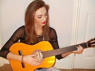
- Costumes and props
 I used this guitar as a prop because it is relevant to the genre of my magazine. As my genre is country a guitar seemed appropriate. Also my model Sarah plays the guitar and keyboard which was one of the reasons I picked her to be on my magazine. The only thing I would change about this image is that it was to small on my double page spread.

Her clothing is rather dark however I asked her to wear a gold necklace around her neck to draw readers attention to her but also to dress up the image a bit more. I used the same clothes and jewellery on the front cover as I did in the double age spread because I wanted to keep it the same throughout the magazine. Also because I was short on time to collect my images and to start my magazine.
- People
The reason I chose Sarah to be my model is because she looks very country type. She can pull of the country look clearly and if I was to put my magazine on sale and didn't specify what genre it was 90% of people would say that it is a country magazine. I wouldn't change my model because Sarah was easy to work with and she responded well to my wishes. I also worked with Lauren Mahan to collect my images as we completed them together in her home. We did this because we both wanted to use Sarah as our models for our magazines but Lauren used her for a different type of magazine compared to mine.
- Mise-en-scene of images

 I used this image on my contents page. I did this because it is different from my front cover. I placed the image where I did because I wanted it out of the way of the text but on the way so you could see it clearly without having to make an effort. I seen a similar magazine set out in this style and I liked it but I went with it. I used this image because it matched with my colour scheme and used the colour in the back of the image for the text in the contents page. I placed the writing down the left side of the page, I used a orange colour which matched the background of the image for the colour of the text. I did this 1 because it stands out but also because it gives the page more colour rather than just being black, white and red. I added two small sections in the bottom of the page for the letter from the editor and also the regulars which i added small amounts of information in to fill the page. Most magazines I looked at had these sections in but either in a different place of different style. I added the large red banner with the title and contents at the top so it was very clear what page your on. I also added the issue number,website and date at the very top so it was still visible to the readers.
 - Costumes and props


Her clothing is rather dark however I asked her to wear a gold necklace around her neck to draw readers attention to her but also to dress up the image a bit more. I used the same clothes and jewellery on the front cover as I did in the double age spread because I wanted to keep it the same throughout the magazine. Also because I was short on time to collect my images and to start my magazine.
- People
The reason I chose Sarah to be my model is because she looks very country type. She can pull of the country look clearly and if I was to put my magazine on sale and didn't specify what genre it was 90% of people would say that it is a country magazine. I wouldn't change my model because Sarah was easy to work with and she responded well to my wishes. I also worked with Lauren Mahan to collect my images as we completed them together in her home. We did this because we both wanted to use Sarah as our models for our magazines but Lauren used her for a different type of magazine compared to mine.
Title font and style
The font I used for my title was myrid pro. I used this font because it was simple and easy. It looked very professional and smart and it was clear to read from a distance. I used a normal style, I didn't want my magazine cover to look messy because I already had italic on the sell lines and I didn't want it to look to busy. I had looked at other country magazines and they all seemed very plain and easy to see. If I was to change my magazine I would make the font more bold and better than what it was because I think that making it bolder would make it stand out more.
Written content
The written content in my double page spread was created by me. I created an interview situation talking to my celebrity 'Natasha' about her life and what she was panning to do next. I also mentioned about her uk tour. I looked at lots of different magazines and their double page spread to get inspiration on what to write and how to make it professional and interesting. I used a simple font for this article. I had to keep the writing small to fit everything onto the page but I wish I could have added more but I didn't have anymore ideas on what to write in the interview.
On the front cover I also wish I had added more sell lines which could of linked into the double page spread. I feel like I didn't post enough content on the front page. However I still think it looks good it's just lacking on the writing side of it.
Music genre and how your magazine suggests it
I chose originally to create a pop magazine but I didn't think my model Sarah looked like a pop model. Because of her looks and the clothes she was wearing I decided to change it and create a country magazine. I also wanted to create a different magazine to everyone else and not many people were creating country magazines.
My magazine suggests that it's country by the font, style, layout and the images I have used. For instance I have used very country colours eg reds, yellow and oranges. The style is very simple but not boring, I tried to change the text about and used different fonts as much as I could without my magazine looking tacky and to messy. The images I used very all very smart and I often changed them around to make the magazine look better.
Layout
Front cover - The layout of my front cover is very simple but pleasing. I have placed the name of the magazine in the top left corner but I have made it big enough to be seen clearly by the reader. I made sure I added the issue number,date and website along the top of the page. I added the price in the top right corner but I wish I had changed the colour of the font from black to a different colour because I don't think it stands out as well as what It should. I like how I only added a few sell lines across the page. This makes it look neat and tidy however if buyers were to pick up my magazine they might get the impression that the magazine doesn't have much content and they may then chose to but a different magazine. The main image across the page is the best feature. It looks great when printed out because I used a high resolution image to ensure that it wouldn't look pixelated when printed on paper. I uses a simple barcode at the bottom of the page just on top of a red bar which attracts attention telling reader to subscribe to the magazine.
Contents page - My contents page layout is very simple. I have placed the title of the magazine, issue number, date and website at the top of the page in a big red banner just like the bottom of the front page. I have placed the actual contents of the magazine down the left side with a large image of my model on the right side of the page. I then added a letter from the editor and a regulars section in the bottom left and right corners.

Monday, 8 April 2013
Final Product
This is my final media product. I created a country music magazine for teenagers. I created a front cover, contents page, and a double page spread.


Sunday, 24 March 2013
Final Magazine - Target Audience
My target for my magazine is mainly teenagers and young adults. I have chosen this because when I created a survey most people who read magazines were younger so I decided that that would be the best for my target audience.
Thursday, 14 March 2013
Final Magazine - Font samples
For my magazine I have decided to use a viriety of fonts. I want to keep them simple but for them to also stand out.
Font samples for magazine
Calibri (body)
Baskerville Old Face
Bradley Hand ITC
Free Style Script
Tahoma
Arial
Lucida Handwriting
Myrid Pro
Noteworthy
Lucida Bright
Zapfino
Lao MW
Myrid Pro
Noteworthy
Lucida Bright
Zapfino
Lao MW
I then considered if I would like the fonts in italic or bold or both
For my magazine I have used Myrid Pro, Noteworthy, Lucida Bright , Zapfino and Lao MW. I used these because they all look very smart and they suit my magazine choice.Final Magazine - Colour Samples
I have chosen for my magazine that I will use colours of mainly red and white. I will use mostly white writing because the background behind Sarah is dark. I wanted red writing but the red agaionst the dark backgorund didn't look as good as the white. The white also stands out well and it is clear to read. The white colours ecpecially the font looks great. I looks very professional and it looks very country style. I have used reds for the name of the magazine because I researched other country magazines and they maily had red titles. However I have made my title of my country magazine different because I didn't want i to look that same but I wanted to make sure the colour styles are the same.
Throughout the magazine I want the wiriting to be either white black or red. I want it to look consistant. This will make it look smarter and I want people to think that it looks good and that they would pick it up if it was for sale in a shop.
Here are some of the colours I have compared and chosen to use.
Final Magazine - Photo Taken
These are the photos I have taken which I will consider using for my magazine. I have put them all together so I can then choose which photo will be most suitable for my front cover, contents page and double page spread. My model is Sarah Jane and I worked with Lauren Mahan to collect them. We took the photos in Sarah's house and tried to use subtle backgrounds to make the editing easier.


 I am not going to use these photos because they either didn't suit my design or the image was not the correct quality and when printed out it was blurry and looked silly.

 I used these images on my magazine. I used this one of my front cover because it filled the full page and it looked the best when printed out. I did use a different image at first but I wasn't so sure on it because when printed it looked blurry and also some fake tan which she was wearing showed up and it didn't look very professional.

For my contents page I used this image. I used it because it draws you in. Also has a yellowy orange tinge to it after editing which then I matched with the writing on the page and I think it looks very good and smart.

For my double page spread I used two images because I didn't want to make the article look busy and clogged up with lots of text so I placed an image to make it look easier to read.


Final Magazine - Photo Rationals
I worked with Lauren Mahan to collect and take my photos. We used Sarah Thoms as a model. I am using her for a country magazine and I have called her Natasha. I have used different images to Lauren because sarah is wearing different clothes and pulling different poses. Which will suit my magazine better.
Lauren used Sarah for her alterniatve music magazine. She was wearing different clothes and we made sure she was using different poses to make sure that she didn't look the same and that ourt magazines wouldn't look too similar.


Lauren used Sarah for her alterniatve music magazine. She was wearing different clothes and we made sure she was using different poses to make sure that she didn't look the same and that ourt magazines wouldn't look too similar.
I was stuck between what images I should use for my magazine. These were my choices.


I am going to use this picture on the front cover because I feel like it draws you into the magazine. The way she stares at you makes you feel like she is talking to you directly. I believe that this is a very good image for a country magazine. It also is very clear when printed as the image is the correct size for an A4 page.

I am going to use this picture for the contents page for my magazine because I want it to feel like she is wanting to make you read more and read on about the article. Also she looks very mysterious as if she is hiding a secret. The position of her hands holding her hood makes you feel like she is teasing you and that you should read on to find out more. I didn't edit this photo because it was the perfect image size for my contents page. Its fits nicely in the right top side of the page.

I used two images
I will use this final picture of her holding a guitar for my double page spread. It gives the reader the feel that she produces her own music and that she is very country style. It also shows that she is very dedicated in her work as she is staring down at her instrument.

Final Magazine - Reece and Photoshoot Planning
We went down to Sunderland Univercity on a monday afternoon and planned out where we would take our photos and which back grounds and props we would use. I had thought about using the univercity however I decided that I could take the photos some place else and spend a lot of time on them to make sure they weren't rushed.
I planned where I would take the photos and which back grounds I would use. However when I finally had the images and I had put them into photoshoot I decided to edit them slightly so that the light looked good behind Sarah.
I planned where I would take the photos and which back grounds I would use. However when I finally had the images and I had put them into photoshoot I decided to edit them slightly so that the light looked good behind Sarah.
Institutional Research
The company I have chosen to produce my music magazine with are cross country music. I have chosen this company because they are a country music magazine which is very popular.
Inspirational Video Links
I have chosen some video links from Youtube that inspires me and what music I like. I like all kinds of music from pop, RnB and country. I have chose 3 that will help isnspire me to create a good music magazine.
I have chosen Taylor Swift for my country star. I think she is tallented and i like her music so I think if i was to create a country music magazine I would loosley base it around her.
I have chosen Nicki Minaj for my RnB music. I like her songs as they are modern and they motivate you as they are up beat and dancy.
For pop music I have chosen the band One Direction as they are very poluar and they create new pop music.
Tuesday, 19 February 2013
Preliminary task review
I thought my preliminary magazine went very well. There is still a few things I would change such as the title and I think I would also change the colour of the title. I would also change the lighting on the image. I would do this because at the moment I think it looks very rushed and it doesn't look very professional. I used Ban and Jay for my models for my prelimanary because I wanted it to look smart. However I wanted it to look causal aswell and I decided that using these two would be a great choice. I worked with Kate Bexley on these photos. We took them together however we used seperate images to make our magazines look different.
When I do my real magazine I am going to change the image on the cover because I want to make it look better. I will make the image be a single person and I will edit the image to make it look good.I have also decided to change the type of magazine from pop to country. I have done this because I have changed my model. I have used a girl for my final magazine. I did this because I wanted a different image from my prelimanary and I also wanted to make it look better. I have changed my magazine from pop to country because she looks like a 'pop' star she looks more like a country star. I also believe that lots of people are making a pop magazine so i want to make mine different so it swill stand out and also look better.
This is a picture of my prelimanary magazine which I created.


#3 Deconstruction of contents page

Masthead
The Masthead is surprisingly at the bottom of the page below the image. This is unusual because most mastheads are at the top of the page(the first thing you see). The colour of he masthead is black.
Other information
There isn't much other information on the page only the title of the magazine at the top of the page before the list of the contents.
Text and Font
There is a lot of text on the page. Down the right side of the page there is a lots of text. This is the contents bit. At the bottom of the page after the masthead there is a paragraph of text. Just about all of the text on the page is black and simple. Most of the writing is italic and some of the writing is italic. The font on the page is all the same apart from the style (italic/bold).
Images
There is two images on the page. One large black and white image in the middle/right side of the page. This is a large image of two men. The other image is in the top left corner. It is in colour and is a woman singing. These images represent the articles in the magazine.
Composition
The layout of the page is that the title is in the left top corner. The actual contents of the page is down the left side of the page just below the small image of the woman singing. There is a large image on the right side of the page and below is an extract from a interview which will be fully on a double page spread somewhere in the magazine.
There is no linguistic features or enigma codes on this contents page.
Colour
There is very little colour on this page. The background is white and just about all of the text is black. There is some small amounts of purple and blue text on the page.
Monday, 4 February 2013
#3 Deconstruction of front cover

Font
The font on this page is very bold and clear to read. The font is very girly.
Text
The text on the front cover is all white with a few yellow lines. 'Miley Cyrus' is placed in the very middle of the page behind a large picture of her. The sub-heading then says 'The queen of tween grows up. But will her fans follow her?'. This suggests that the magazine will be about her and it also makes you want to find out due to the use of rhetorical question used in the writing. There is also text down the side with small points from the stories that will be inside the magazine.
Colour
The colour scheme of this magazine is very girly with purples, yellows and whites. There is a purple back ground and then they have used white and yellow text on top of it so you can clearly see what it says.
Body Language
The layout of the page is that the title is at the top of the page and the large image is placed just underneath the title and it fans out and takes up the whole page. The small writing is placed on either side of the large image.
Lighting
The lighting of the image is used to make her face look a lot lighter than anything else on the page. This bring our attention to her.
Composition
Overall the text is placed in and around the large image that is placed in the very middle of the page.
Monday, 21 January 2013

Subscribe to:
Comments (Atom)