Sunday, 24 March 2013
Final Magazine - Target Audience
My target for my magazine is mainly teenagers and young adults. I have chosen this because when I created a survey most people who read magazines were younger so I decided that that would be the best for my target audience.
Thursday, 14 March 2013
Final Magazine - Font samples
For my magazine I have decided to use a viriety of fonts. I want to keep them simple but for them to also stand out.
Font samples for magazine
Calibri (body)
Baskerville Old Face
Bradley Hand ITC
Free Style Script
Tahoma
Arial
Lucida Handwriting
Myrid Pro
Noteworthy
Lucida Bright
Zapfino
Lao MW
Myrid Pro
Noteworthy
Lucida Bright
Zapfino
Lao MW
I then considered if I would like the fonts in italic or bold or both
For my magazine I have used Myrid Pro, Noteworthy, Lucida Bright , Zapfino and Lao MW. I used these because they all look very smart and they suit my magazine choice.Final Magazine - Colour Samples
I have chosen for my magazine that I will use colours of mainly red and white. I will use mostly white writing because the background behind Sarah is dark. I wanted red writing but the red agaionst the dark backgorund didn't look as good as the white. The white also stands out well and it is clear to read. The white colours ecpecially the font looks great. I looks very professional and it looks very country style. I have used reds for the name of the magazine because I researched other country magazines and they maily had red titles. However I have made my title of my country magazine different because I didn't want i to look that same but I wanted to make sure the colour styles are the same.
Throughout the magazine I want the wiriting to be either white black or red. I want it to look consistant. This will make it look smarter and I want people to think that it looks good and that they would pick it up if it was for sale in a shop.
Here are some of the colours I have compared and chosen to use.
Final Magazine - Photo Taken
These are the photos I have taken which I will consider using for my magazine. I have put them all together so I can then choose which photo will be most suitable for my front cover, contents page and double page spread. My model is Sarah Jane and I worked with Lauren Mahan to collect them. We took the photos in Sarah's house and tried to use subtle backgrounds to make the editing easier.


 I am not going to use these photos because they either didn't suit my design or the image was not the correct quality and when printed out it was blurry and looked silly.

 I used these images on my magazine. I used this one of my front cover because it filled the full page and it looked the best when printed out. I did use a different image at first but I wasn't so sure on it because when printed it looked blurry and also some fake tan which she was wearing showed up and it didn't look very professional.

For my contents page I used this image. I used it because it draws you in. Also has a yellowy orange tinge to it after editing which then I matched with the writing on the page and I think it looks very good and smart.

For my double page spread I used two images because I didn't want to make the article look busy and clogged up with lots of text so I placed an image to make it look easier to read.


Final Magazine - Photo Rationals
I worked with Lauren Mahan to collect and take my photos. We used Sarah Thoms as a model. I am using her for a country magazine and I have called her Natasha. I have used different images to Lauren because sarah is wearing different clothes and pulling different poses. Which will suit my magazine better.
Lauren used Sarah for her alterniatve music magazine. She was wearing different clothes and we made sure she was using different poses to make sure that she didn't look the same and that ourt magazines wouldn't look too similar.


Lauren used Sarah for her alterniatve music magazine. She was wearing different clothes and we made sure she was using different poses to make sure that she didn't look the same and that ourt magazines wouldn't look too similar.
I was stuck between what images I should use for my magazine. These were my choices.


I am going to use this picture on the front cover because I feel like it draws you into the magazine. The way she stares at you makes you feel like she is talking to you directly. I believe that this is a very good image for a country magazine. It also is very clear when printed as the image is the correct size for an A4 page.

I am going to use this picture for the contents page for my magazine because I want it to feel like she is wanting to make you read more and read on about the article. Also she looks very mysterious as if she is hiding a secret. The position of her hands holding her hood makes you feel like she is teasing you and that you should read on to find out more. I didn't edit this photo because it was the perfect image size for my contents page. Its fits nicely in the right top side of the page.

I used two images
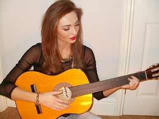
I will use this final picture of her holding a guitar for my double page spread. It gives the reader the feel that she produces her own music and that she is very country style. It also shows that she is very dedicated in her work as she is staring down at her instrument.

Final Magazine - Reece and Photoshoot Planning
We went down to Sunderland Univercity on a monday afternoon and planned out where we would take our photos and which back grounds and props we would use. I had thought about using the univercity however I decided that I could take the photos some place else and spend a lot of time on them to make sure they weren't rushed.
I planned where I would take the photos and which back grounds I would use. However when I finally had the images and I had put them into photoshoot I decided to edit them slightly so that the light looked good behind Sarah.
I planned where I would take the photos and which back grounds I would use. However when I finally had the images and I had put them into photoshoot I decided to edit them slightly so that the light looked good behind Sarah.
Institutional Research
The company I have chosen to produce my music magazine with are cross country music. I have chosen this company because they are a country music magazine which is very popular.
Inspirational Video Links
I have chosen some video links from Youtube that inspires me and what music I like. I like all kinds of music from pop, RnB and country. I have chose 3 that will help isnspire me to create a good music magazine.
I have chosen Taylor Swift for my country star. I think she is tallented and i like her music so I think if i was to create a country music magazine I would loosley base it around her.
I have chosen Nicki Minaj for my RnB music. I like her songs as they are modern and they motivate you as they are up beat and dancy.
For pop music I have chosen the band One Direction as they are very poluar and they create new pop music.
Subscribe to:
Comments (Atom)